7 Elements of Interior Design
Seven often seems like a magic number, and there’s no exception when it comes to interior design. If you’ve been stuck in a home decor rut, look to the seven elements and principles of interior design for creative inspiration. You might be surprised at how much you can learn by going back to the basics. Just read on to find out for yourself!
7 Elements of Interior Design
What Are the 7 Basic Elements of Interior Design?
As the old saying goes, “The whole is more than the sum of its parts.” The same thing is true for interior design — which is really just an illusion created by balancing different elements effectively.
Think of it like this: learning about the ingredients that go into your favorite recipes will help you master cooking. In the same way, learning about the design elements that go into your favorite styles will help you master decorating.
So what are the seven key elements of interior design? They include:
- Color
- Form
- Light
- Line
- Pattern
- Texture
- Space
Color
Color is more than just an aesthetic choice — it can also influence the entire mood and feeling of a space. For example, most people think of red as a “passionate” or “intense” hue, while blues and greens are usually perceived as “tranquil” or “soothing” and yellow is often associated with words like “happy” and “optimistic.” Think about not only your visual preferences, but also, the sort of energy or attitude you’re trying to cultivate when deciding on a color scheme for your room.
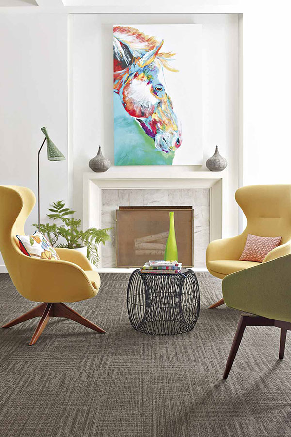
Form
“Form” is simply another term for “shape,” expressing the contours of any artwork, furniture, or other 3-D object you could imagine. Furniture, sculpture, and even rooms themselves can take on two types of forms: organic forms (which are natural and irregular, with curvy or abstract shapes), and geometric forms (which feature sharp, man-made lines and edges, like squares or triangles).
Light
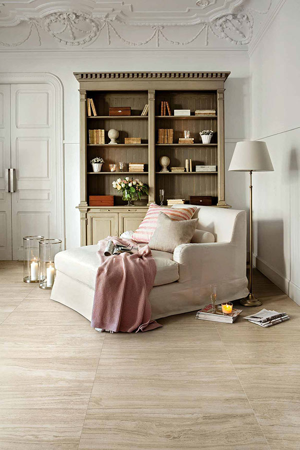
Have you ever cringed at a photograph that was taken in bad lighting? Then you already know the power that lighting has to affect our perception!
Quality lighting is integral to any space, whether its sources are natural, man-made, or some combination of both. When choosing lighting for your room, think about factors like the color of the light (cool blue or warm yellow?), the light intensity (bright for cooking, or soft for reading?), and whether the light should be dimmable.
Line
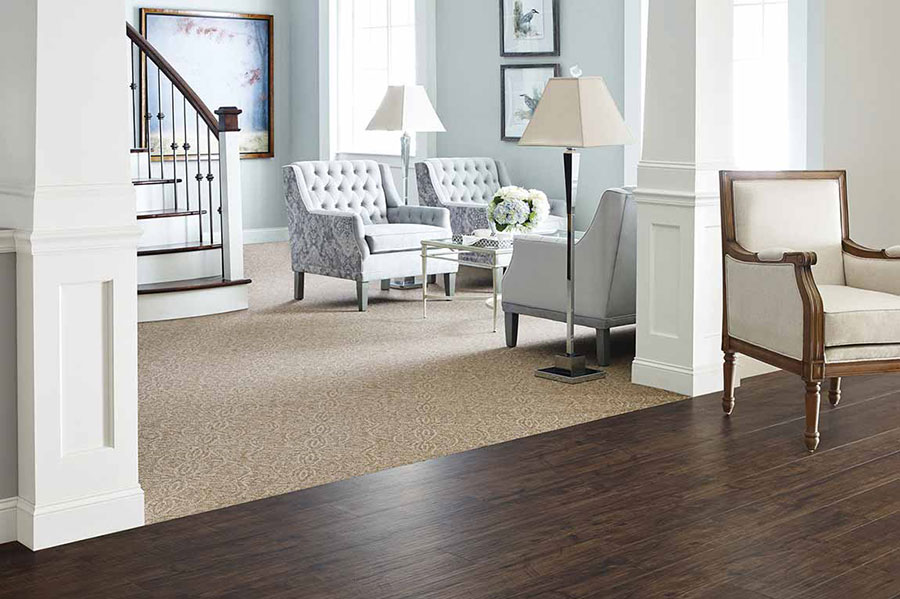
Think of line as the perimeter around a form or shape. For example, if you were to draw any object in the room, you would probably start with its outline.
Lines can be “vertical” (up-and-down), “horizontal” (side-to-side), or “dynamic” (lines that express motion, like zig-zags or curlicues). Design experts say that horizontal lines create a feeling of security, while vertical lines are expressive and bold. Dynamic lines, which follow their own set of rules, can add a fun, exciting touch to any space when used strategically.
Pattern
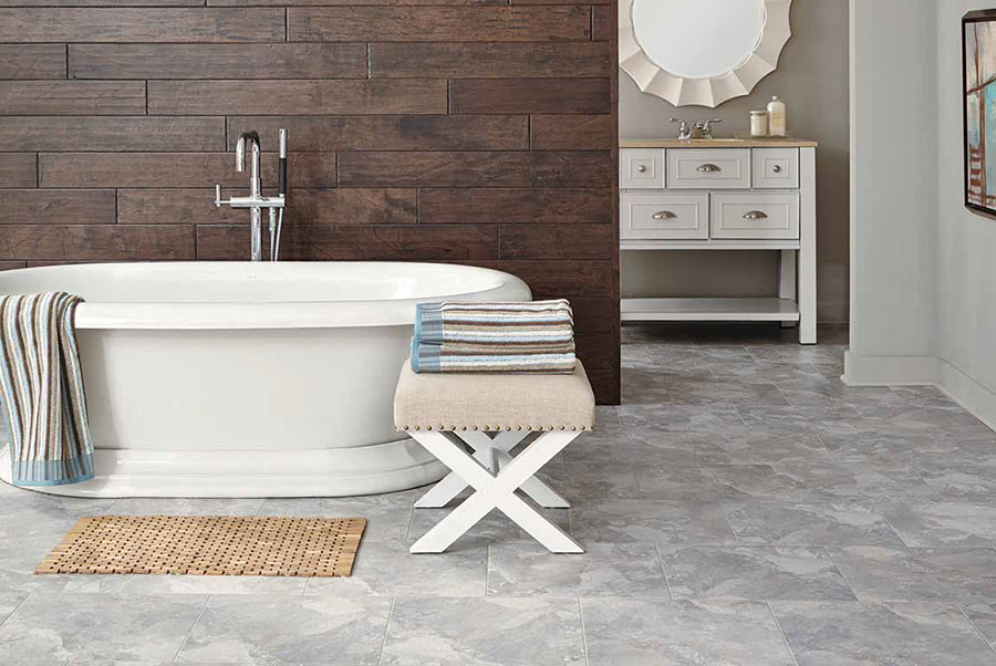
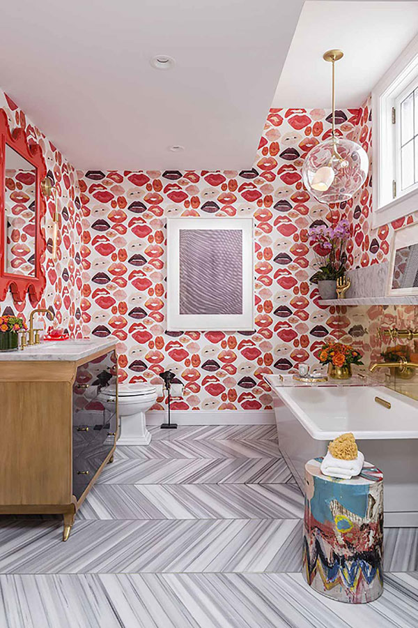
A pattern is the intentional repetition of forms, lines, or other design elements. Patterns usually pop up on wallpaper or fabrics, but can appear anywhere in the home, even in the use of light or other design elements. While patterns can add life and motion to a space, too many clashing patterns can start to look chaotic, so tread lightly when choosing your favorite prints.
Texture
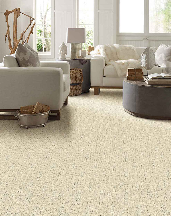
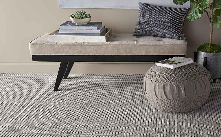
Not to be confused with pattern, texture is the way an object feels. This can mean the way the object literally feels to the touch, or the sense it gives when simply observing the object. For example, you might say that a surface looks “weathered” or “vintage” without actually touching it, thanks to the creative use of texture.
Careful consideration of texture is especially important in parts of the home that you contact frequently, like your flooring. We can help you find floors with the perfect, comfortable texture to start every day on the right foot.
Space
Last but not least, space is at the heart of virtually every design decision. There are two basic types of space to consider: 2-D space (which accounts for the length and width of a room), and 3-D space (which covers height). For example, only 2-D space is important when thinking of carpets or rugs — but you’ll need to think about 3-D space before adding new shelving or furniture. It’s also important to leave enough empty or “negative” space to allow for fluid, easy navigation (and break the room up visually).
Cutesy : #flooringamerica
#modern_interior
#home_decor #living #fabric #inspiration #designer_wallpapers
#designers_furniture #modernfurniture #renovations #architectural
#constructions #luxuryliving #interiordesign #inspiration #commercial
#conceptual #renovation #designandbuild #design #homeliving #homedecor
#builder #residentialdesign #commercialdesign #shoplotdesign
#spaceplanning #spacedesign #modern_interior
#designersfurniture #Araria #Purnea #Kishanganj #Madhepura #Saharsa #Supaul #Patna #Siwan #Betiah #Chhapra #RaskaInteriors #Raska #Interiors
Comments